Dishcision.
From craving to cuisine.
Project
Dishcision
Type
UX/UI Mobile App Design
Role
Visual Designer
Duration
1–2 months
The Framework
Rather than adding more filters or recommendations, I reimagined the decision-making journey itself.
01 — Decide the Dish First
Help users identify what they want to eat before asking where they want to order from.
02 — Reduce Cognitive Load
Present one meaningful decision at a time instead of overwhelming users with endless restaurant listings and menus.
03 — Explore Through Visual Discovery
High-quality dish imagery, categories, and contextual recommendations make browsing intuitive and enjoyable.
04 — Reach Ordering Faster
Once users decide on a dish, seamlessly connect them with nearby restaurants offering it, minimizing unnecessary steps.
These principles shaped every design decision that followed.
The Story
The Shift: food apps have become excellent at helping people find restaurants, but they still do little to answer the most important question what do I actually feel like eating?
The Core Insight: users rarely know the restaurant first. They crave a dish, a flavor, a texture, or a mood. Existing platforms force users to browse restaurants before discovering food, creating unnecessary cognitive effort.
The Opportunity: Dishcision is a dish-first discovery platform that reverses the traditional journey: Craving → Dish → Restaurant → Order, instead of Restaurant → Menu → Dish → Order.
Design Goal: design a decision-first food discovery experience that helps people confidently choose what to eat before deciding where to order from.
Key Product Decisions
Card 01
Dish-first instead of Restaurant-first
Traditional food apps begin with restaurants, assuming users already know where they want to order from. Dishcision reverses this flow because users usually know what they're craving before they know which restaurant to choose.
Card 02
Progressive Discovery instead of Endless Lists
Rather than overwhelming users with hundreds of restaurants, the experience reveals meaningful choices step by step, reducing cognitive load and making decisions feel easier.
Card 03
Inspiration before Search
Search works well when users know exactly what they want. Dishcision prioritizes discovery because many users begin with uncertainty rather than a specific query.
Card 04
Decision Support over Food Delivery
Dishcision is not trying to replace delivery platforms. Its primary purpose is to help users confidently decide what to eat, while existing delivery services handle ordering.
Every design decision was guided by one question: How can choosing what to eat feel easier than finding where to eat?
From Concept to Launch
Phase 01
MVP (Version 1)
The initial release intentionally focuses on solving one core problem: helping users confidently decide what to eat.
- Dish-first discovery
- Smart filtering by cuisine, mood, and cravings
- Save dishes for later
- Restaurant matching
- Seamless transition to ordering
Every feature included in the MVP directly contributes to reducing food decision fatigue.
Phase 02
Future Roadmap
Opportunities scoped out of the first release, to be introduced once the core behavior is validated.
- AI-powered craving recommendations
- Group decision mode
- Taste profile personalization
- Social recommendations
- Food journaling
Intentionally postponed to validate the core user behavior before expanding the product.
Phase 03
Success Metrics
How I would measure success after launch.
- Time taken to choose a dish
- Decision completion rate
- Saved dishes per user
- Repeat weekly usage
- Conversion from dish discovery to ordering
The goal isn't to maximize browsing, it's to help users reach confident decisions faster.
Design System
Green + Red + Black on White
Clean, decisive, food-forward.
Green
#00C97B
Red
#E53935
Black
#1A1A1A
Visual Gallery
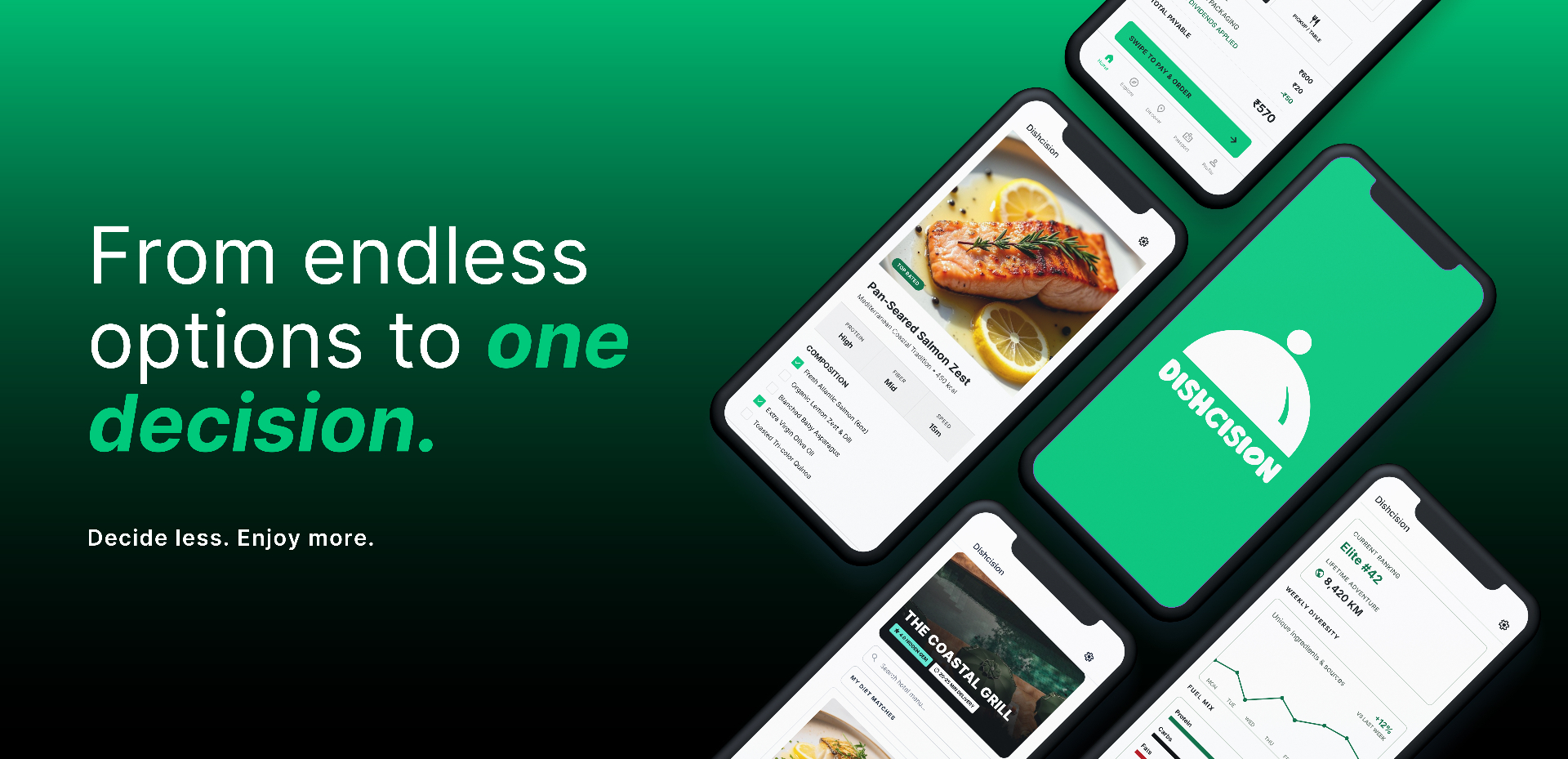
01 — From craving to cuisine
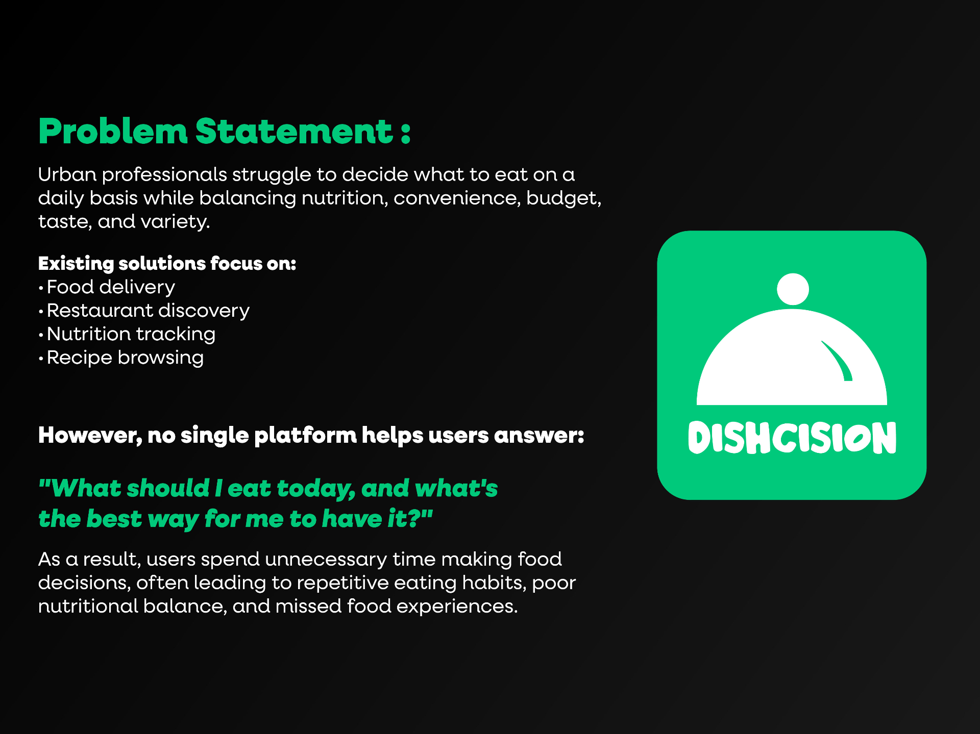
02 — Problem — gap in existing solutions
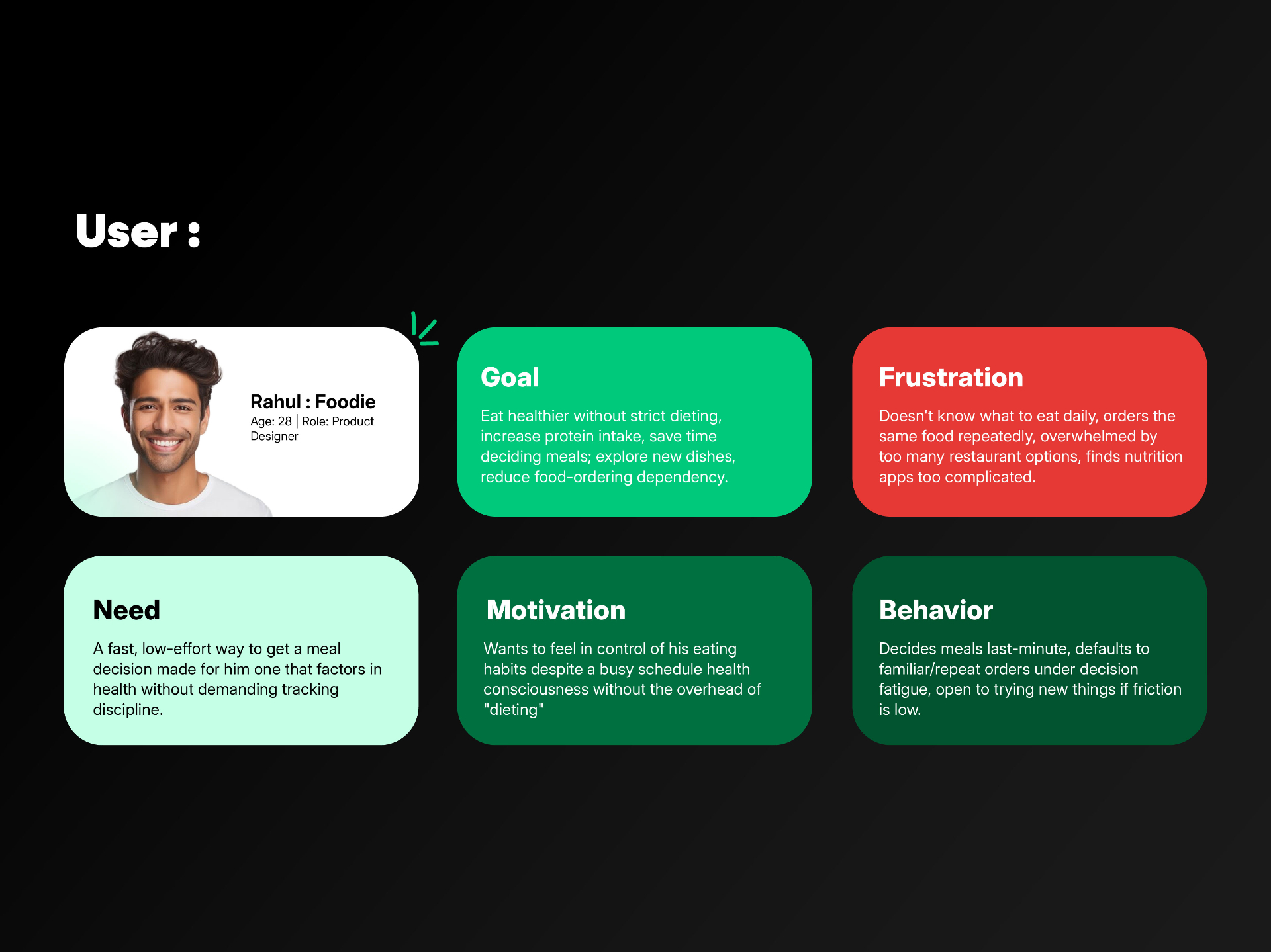
03 — 03 — USER PERSONAS — RAHUL
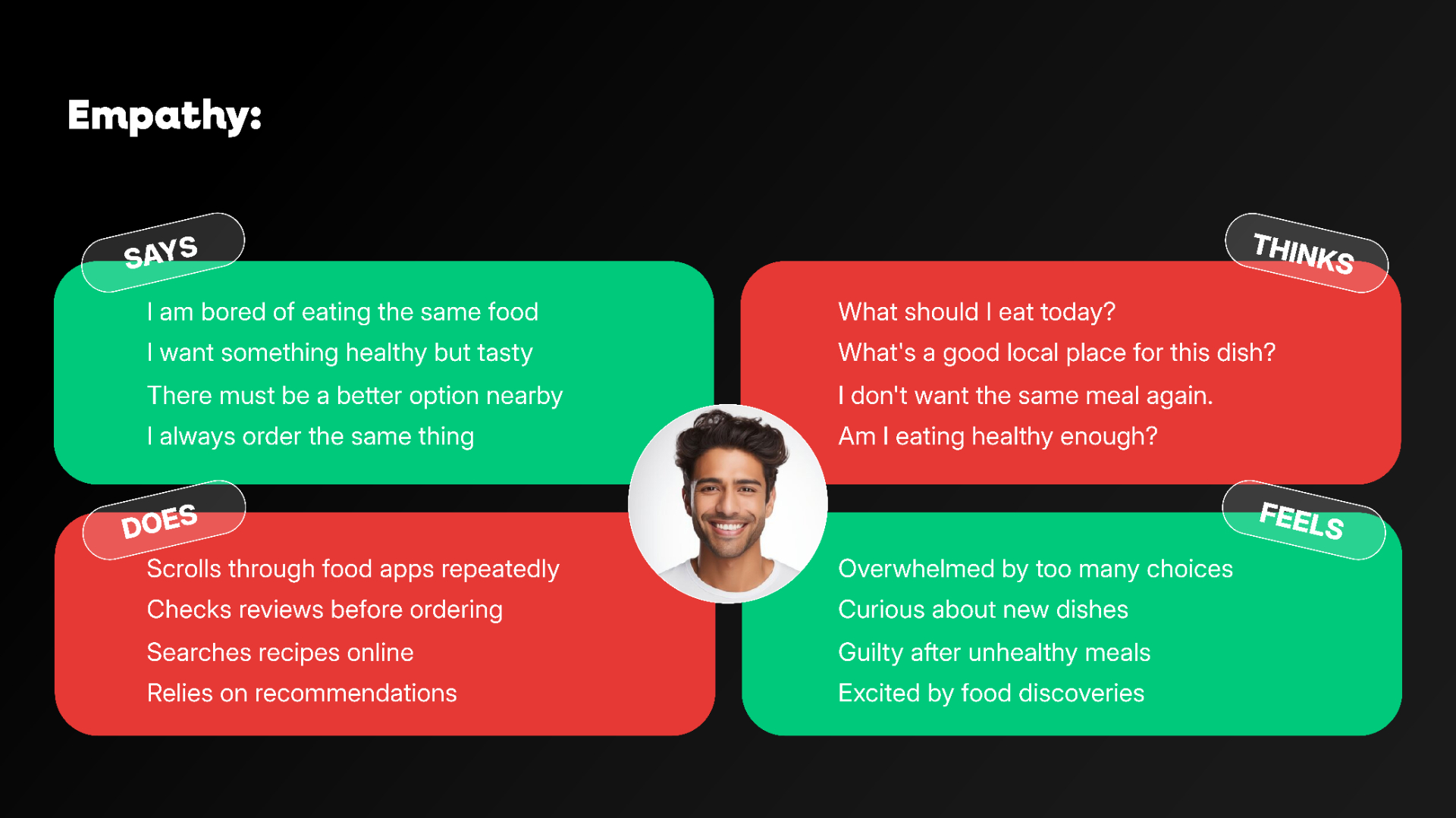
04 — Empathy map
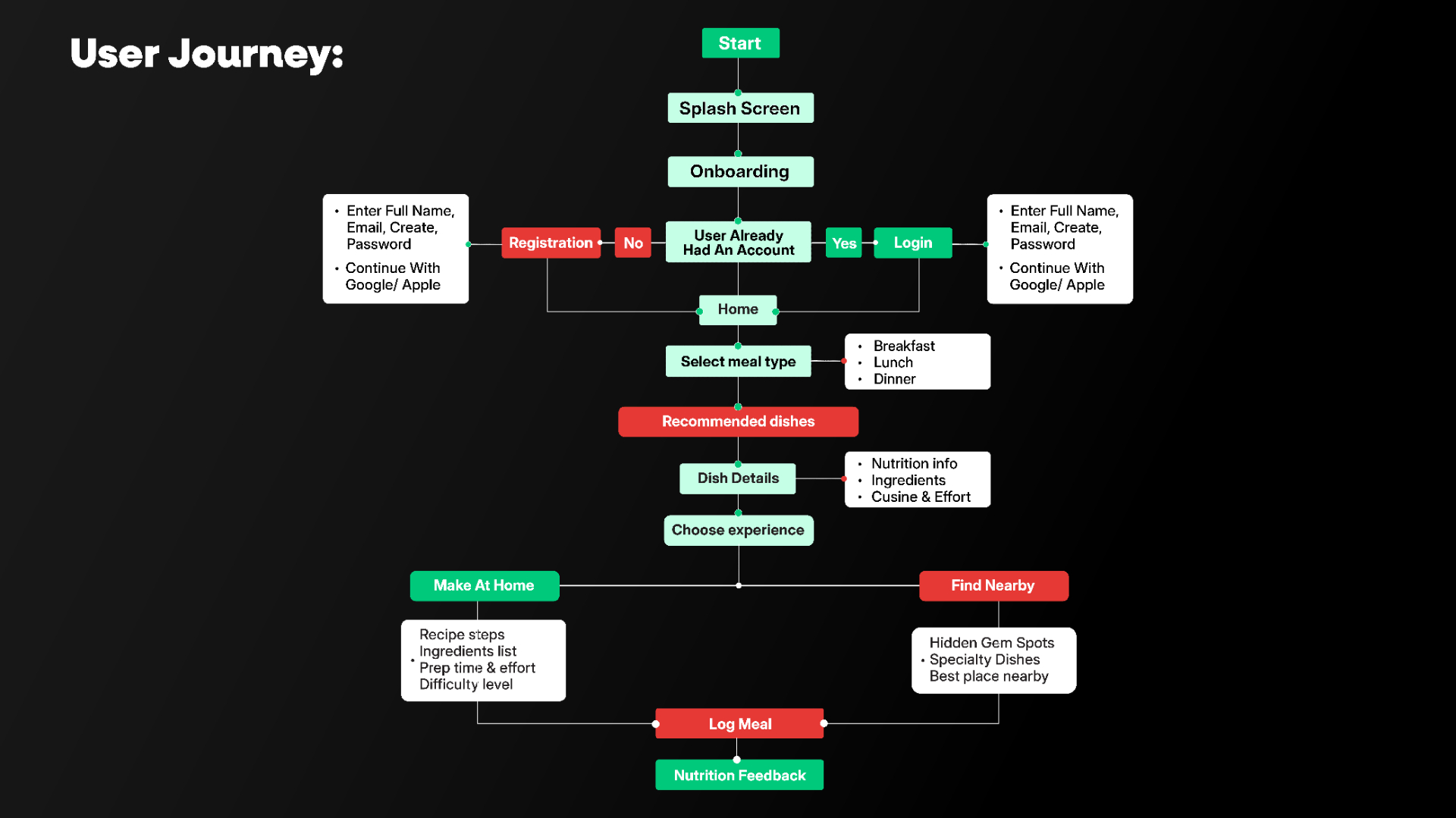
05 — User flow — Daily Meal Recommendation
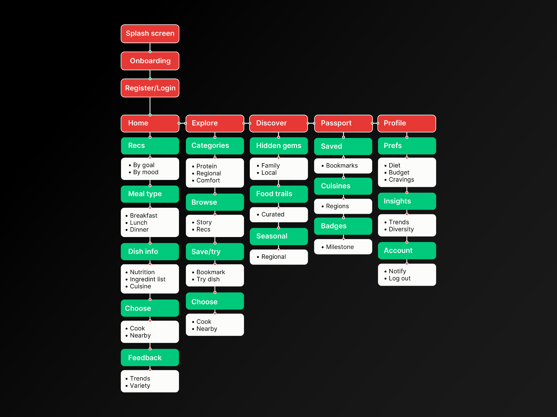
06 — Information Architecture
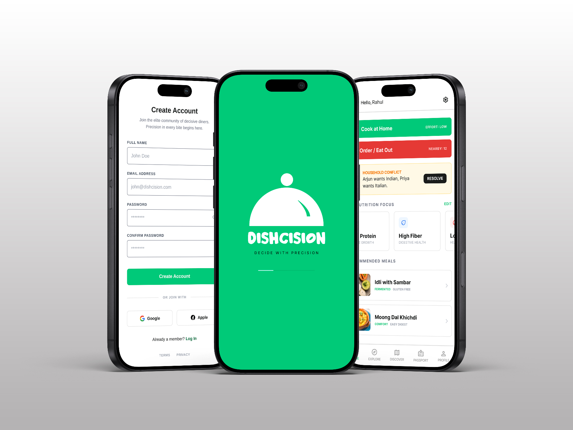
07 — Splash + Onboarding + Home Dashboard
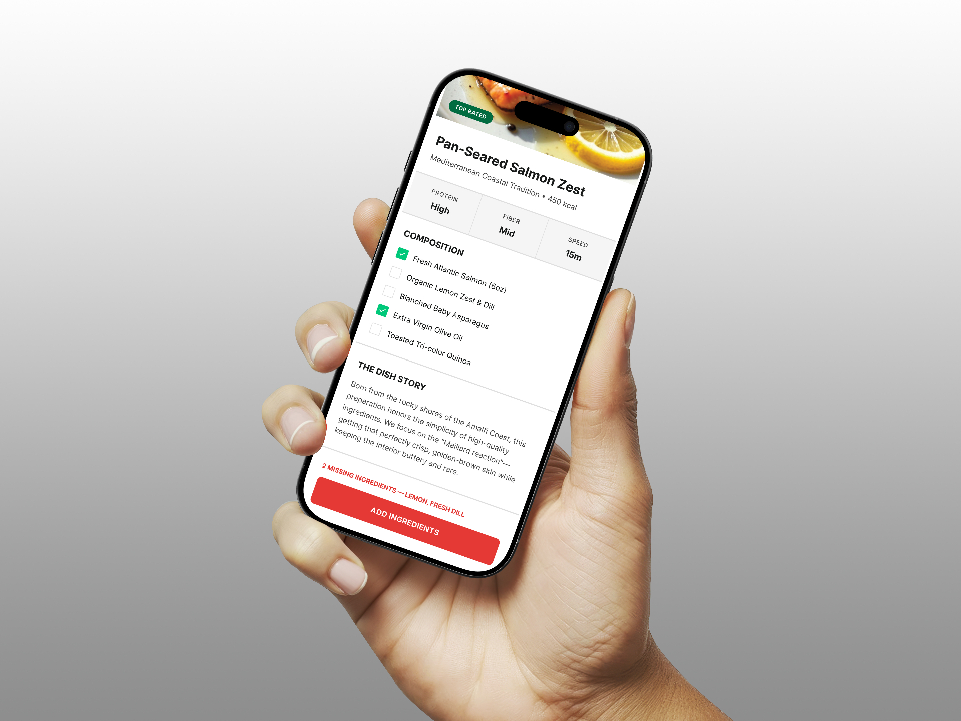
08 — Recipe Detail — missing ingredients CTA
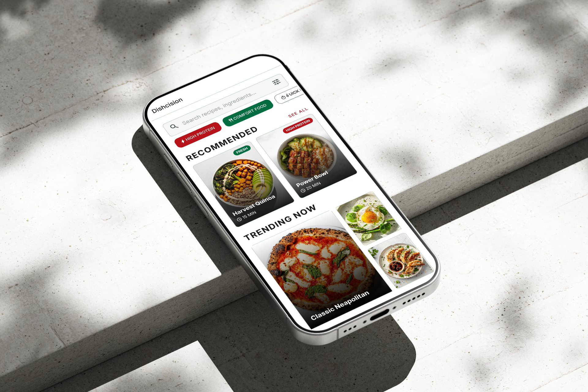
09 — Explore screen
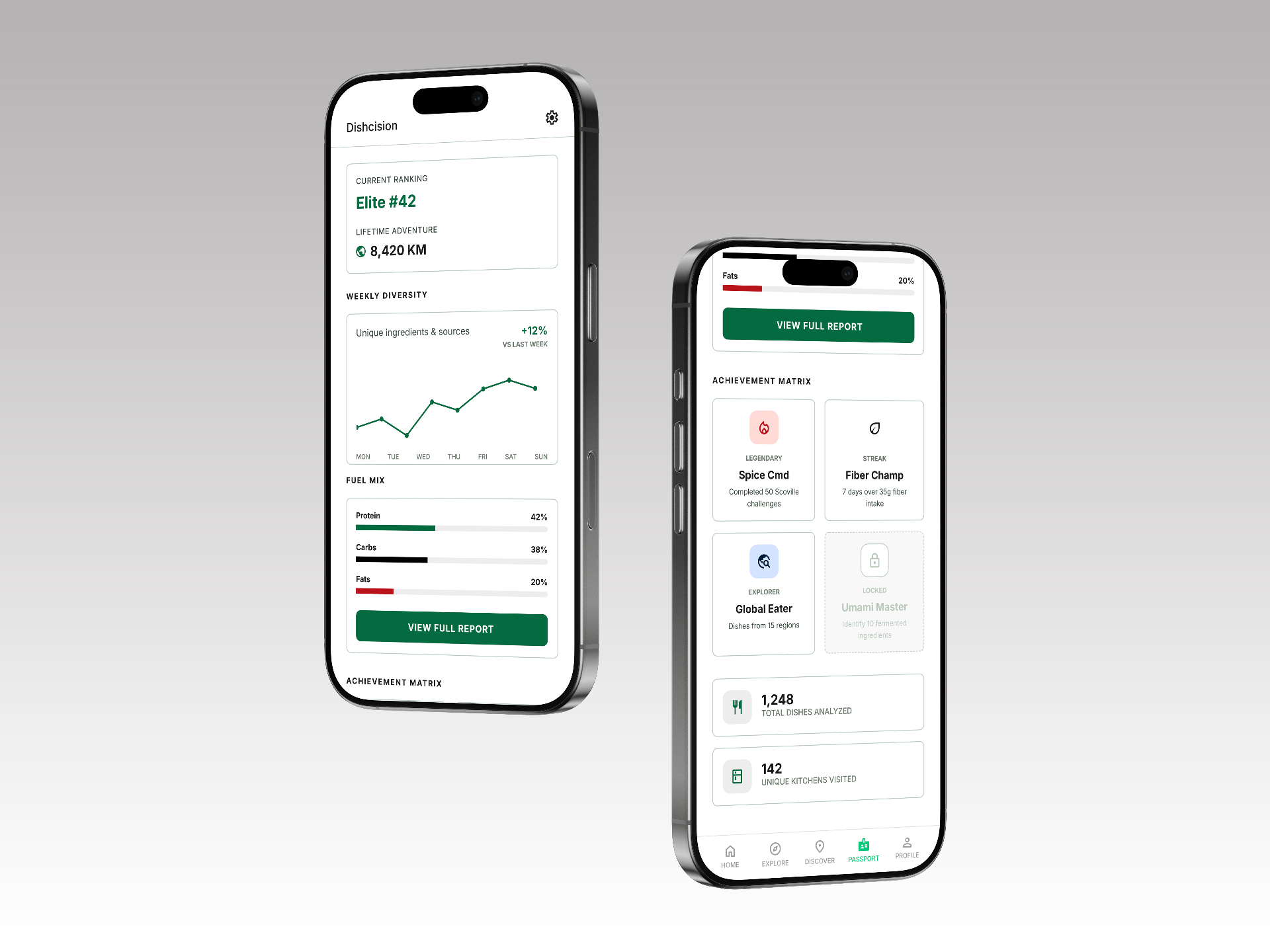
10 — Food Passport / Insights
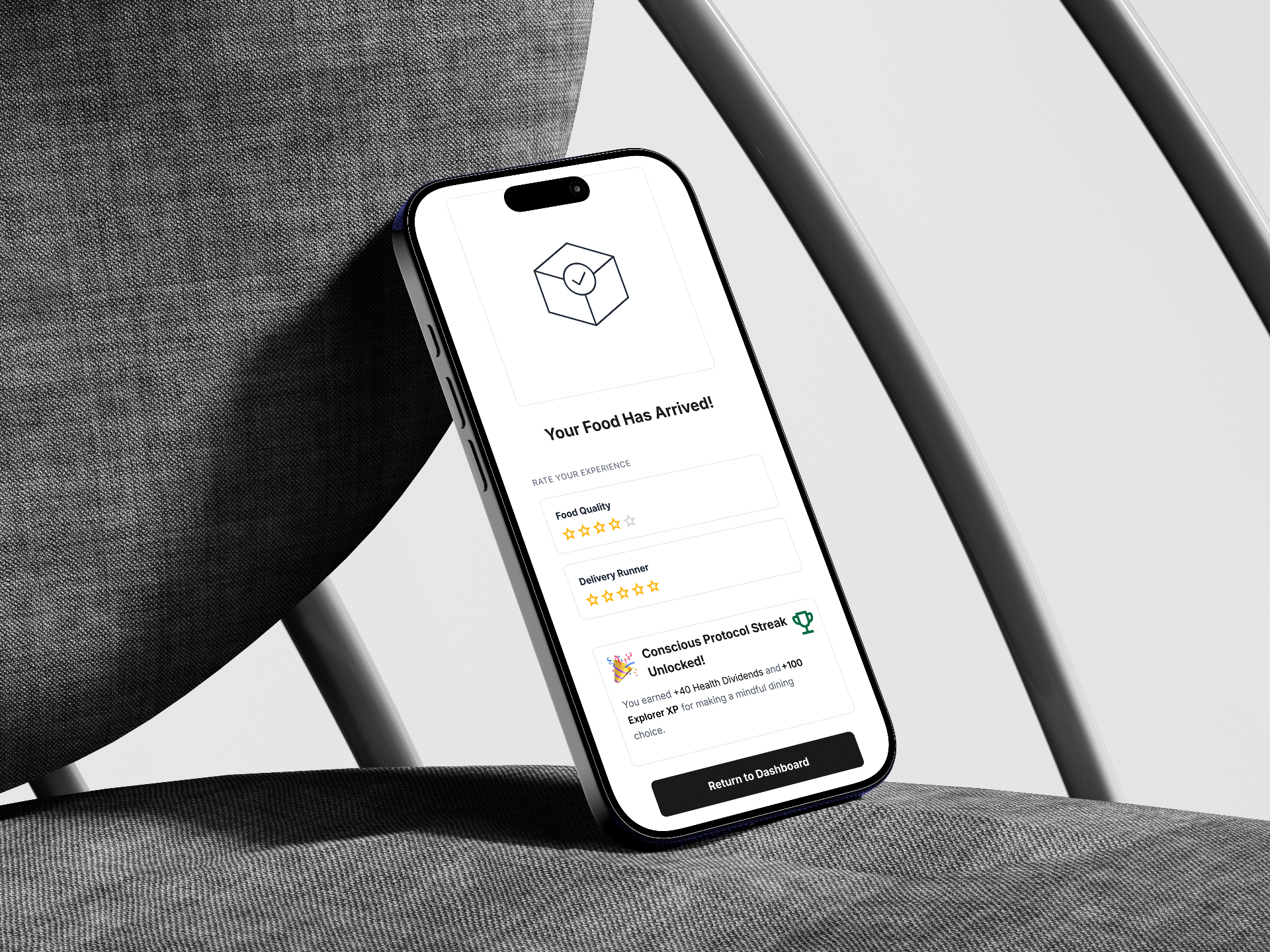
11 — Order Delivered + gamification
Reflection
Biggest Insight
The project revealed a deeper problem than expected: people rarely struggle to find food, they struggle to decide. Designing around decision-making rather than food discovery fundamentally changed the product direction.
What I Learned
The project reinforced the value of product thinking over design execution.
- Challenging existing user flows
- Defining the core problem before designing solutions
- Prioritizing user behavior over feature quantity
What I Would Validate Next
If Dishcision were developed further, I would validate:
- Whether users naturally think in terms of dishes before restaurants
- How group decision-making changes the experience
- Which recommendation model drives the fastest decisions
- Long-term user retention after the novelty wears off
Looking Ahead
"Dishcision isn't intended to replace food delivery apps. It's designed to solve the moment that happens before ordering, the decision itself. That's the opportunity I would continue exploring."