TripSplit.
Making shared travel expenses transparent, fair, and stress-free.
Role
Visual Designer
Duration
6 Weeks
Platform
Mobile
Team
Solo Project
Focus
Product Strategy, UX, UI
The Framework
TripSplit reframes group expenses from a payments problem into a coordination, trust, and transparency problem.
01 — Coordination, not payments
Groups can already send money. What they can't do is agree on who owes whom without a spreadsheet, a chat thread, and a difficult conversation.
02 — Transparency over transactions
If everyone can see the same picture of shared expenses in real time, trust stops depending on memory or one person's notes.
03 — Automate the math, own the moment
Auto-splits, running balances, and one-tap settlements remove effort. The product's real job is protecting the group's relationships.
04 — One focused product
A payment gateway for group travel — not a super app. Create Group → Add Expense → Auto Split → View Balance → Settle. Nothing else competes for attention.
Every design decision downstream was measured against these four principles.
The Story
The Shift: payment apps solved money movement a decade ago. Groups still fight over shared expenses because no one is tracking, reconciling, or explaining them.
The Core Insight: the friction isn't sending ₹500. It's remembering who paid for the cab, agreeing what counts as shared, and asking a friend to pay you back without it feeling weird.
The Opportunity: TripSplit is a group financial coordination product. It replaces spreadsheets, screenshots, and mental math with a transparent, shared view of every expense and every balance.
Design Goal: make shared expenses feel effortless so the trip stays about the trip.
Process
Key Product Decisions
Card 01
Track before you settle
Settlement is the last mile, not the product. Expense tracking comes first because trust is built by seeing every entry, not by transferring money at the end.
Card 02
Summaries over transaction lists
A raw ledger answers 'what happened.' A summary answers 'what do I owe, and to whom?' the only question users actually open the app to resolve.
Card 03
Visual balances build trust
Colour-coded balances and directional arrows make fairness legible at a glance. Numbers alone invite disputes; visuals invite agreement.
Card 04
Automate the math, not the decisions
The app auto-splits, rounds, and reconciles. It never decides who should pay for what. Automation removes effort without removing agency.
Each decision protects the same outcome: the group agrees, quickly, without a difficult conversation.
From Concept to Launch
Phase 01
MVP (Version 1)
Version 1 solves one thing well: helping a group agree on shared expenses and settle them without friction.
- Add expenses
- Split expenses
- Balance overview
- Settlement flow
- Trip summary
Every MVP feature maps directly to reducing the awkward conversation.
Phase 02
Future Roadmap
Deliberately scoped out of V1 to validate the core behaviour first: do groups actually shift from ad-hoc tracking to a shared source of truth?
- AI receipt scanning
- Multi-currency support
- Budget forecasting
- Shared savings goals
- Smart reminders
Postponed until the core loop is proven, added complexity is only worth it once the base habit sticks.
Phase 03
Success Metrics
If TripSplit launched today, I would measure:
- Settlement completion rate
- Average time to settle
- Expenses logged per trip
- Repeat trip creation
- Reduction in unresolved balances
The goal isn't more transactions, it's fewer unresolved balances and fewer difficult conversations.
Design System
Royal Blue + Dusty Pink + Aubergine
Warm but trustworthy. Not clinical like a banking app, not playful like a game.
Royal Blue
#2A4BA0
Dusty Pink
#D9A6A6
Aubergine
#3D1F3D
Visual Gallery
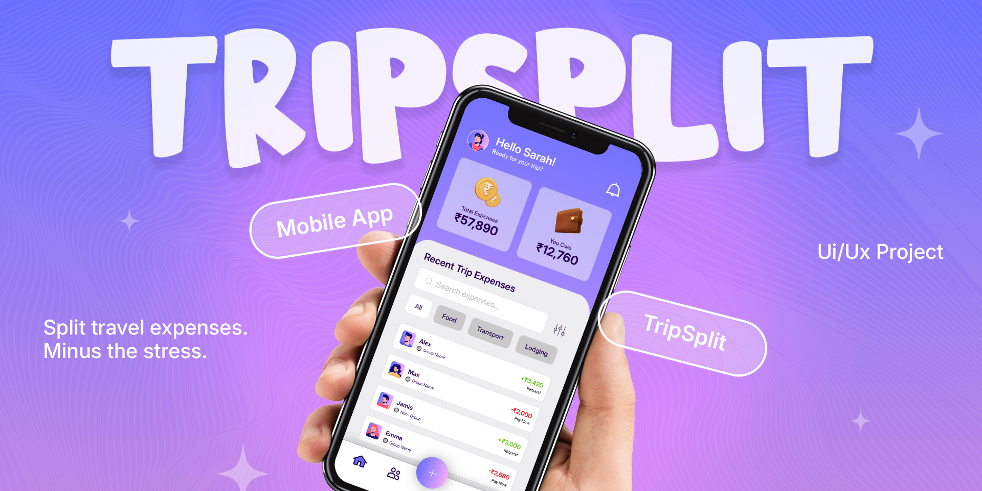
01 — Split expenses. Skip the stress.
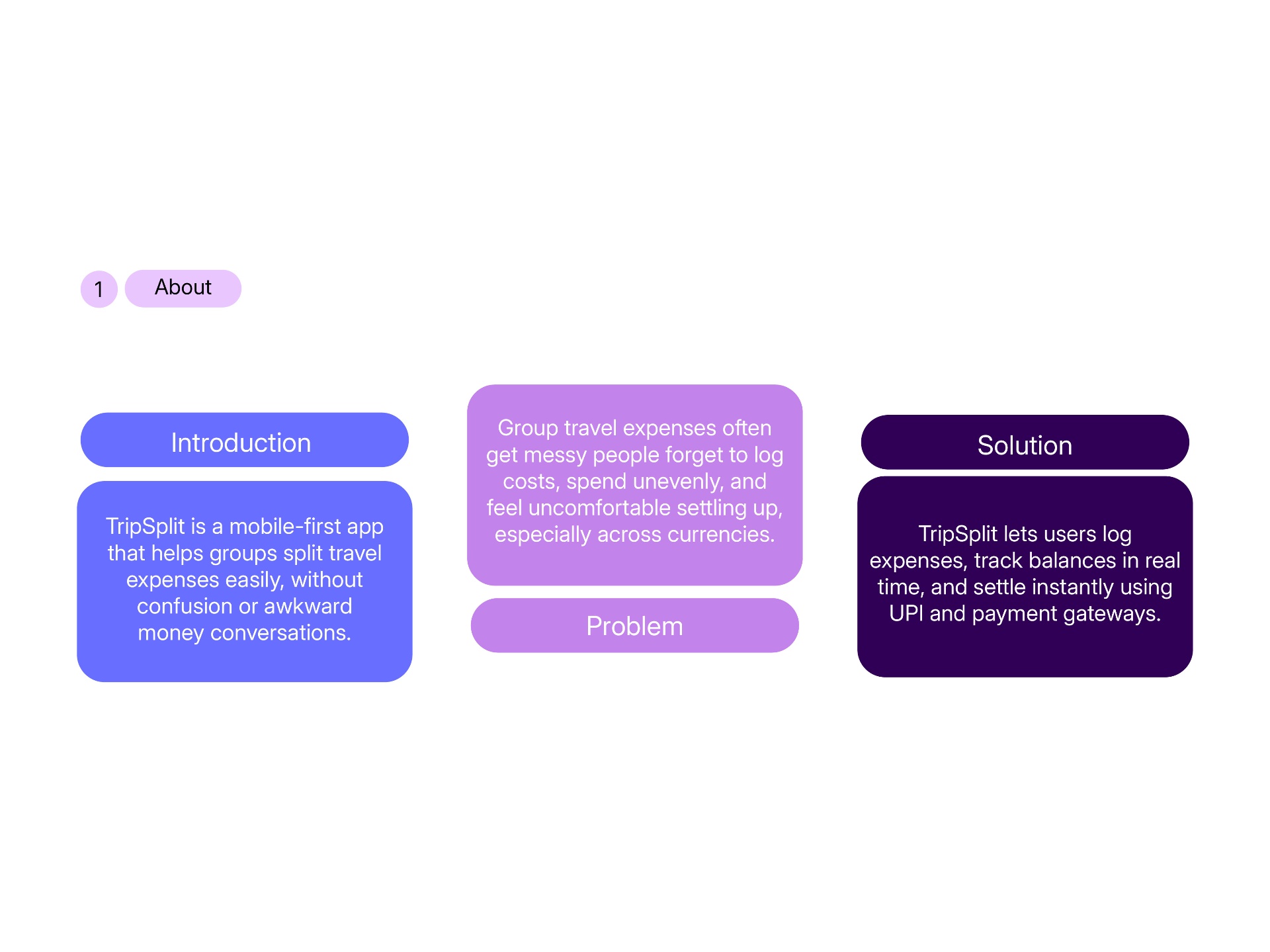
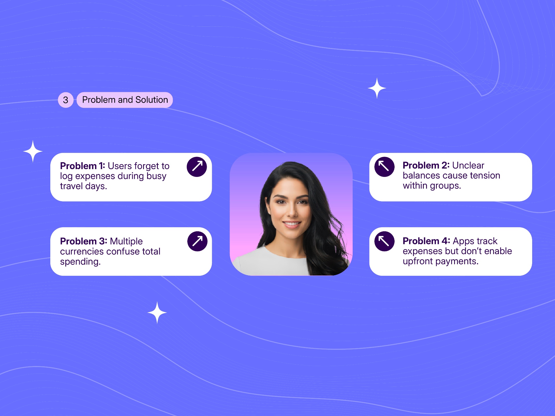
02 — Problem + Solution slide
03 — User Persona — Sara the Organizer
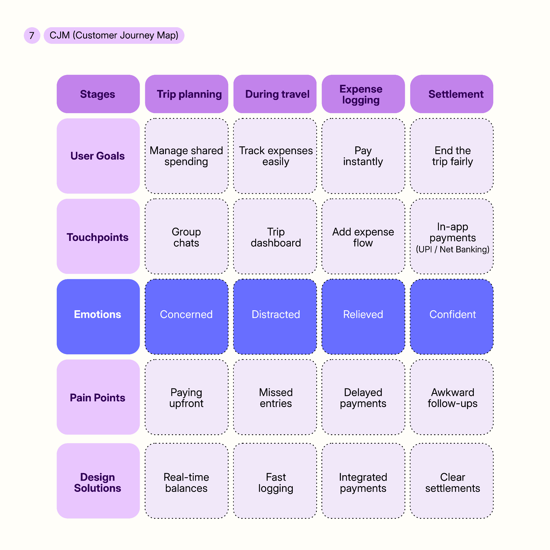
04 — Customer Journey Map
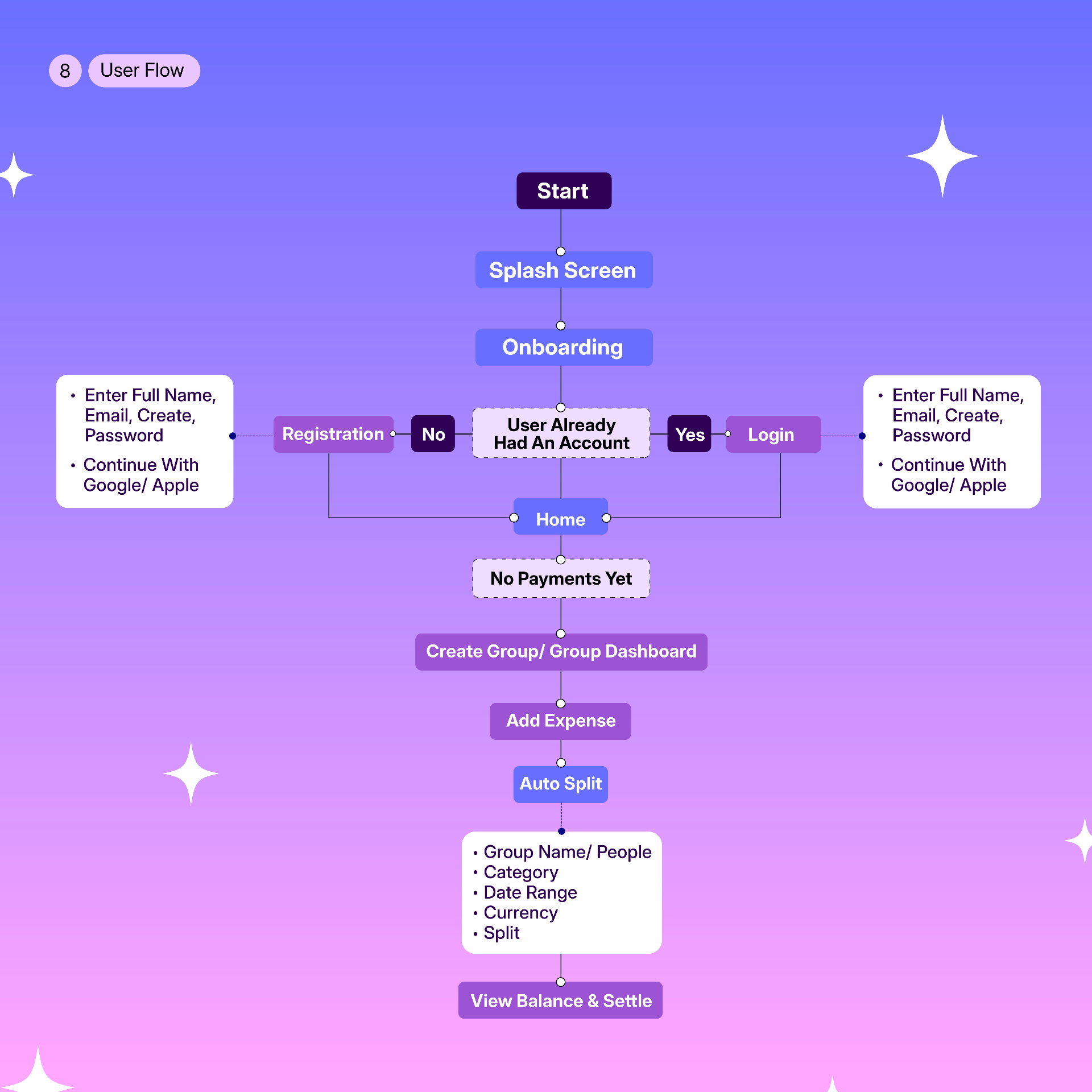
05 — User Flow diagram
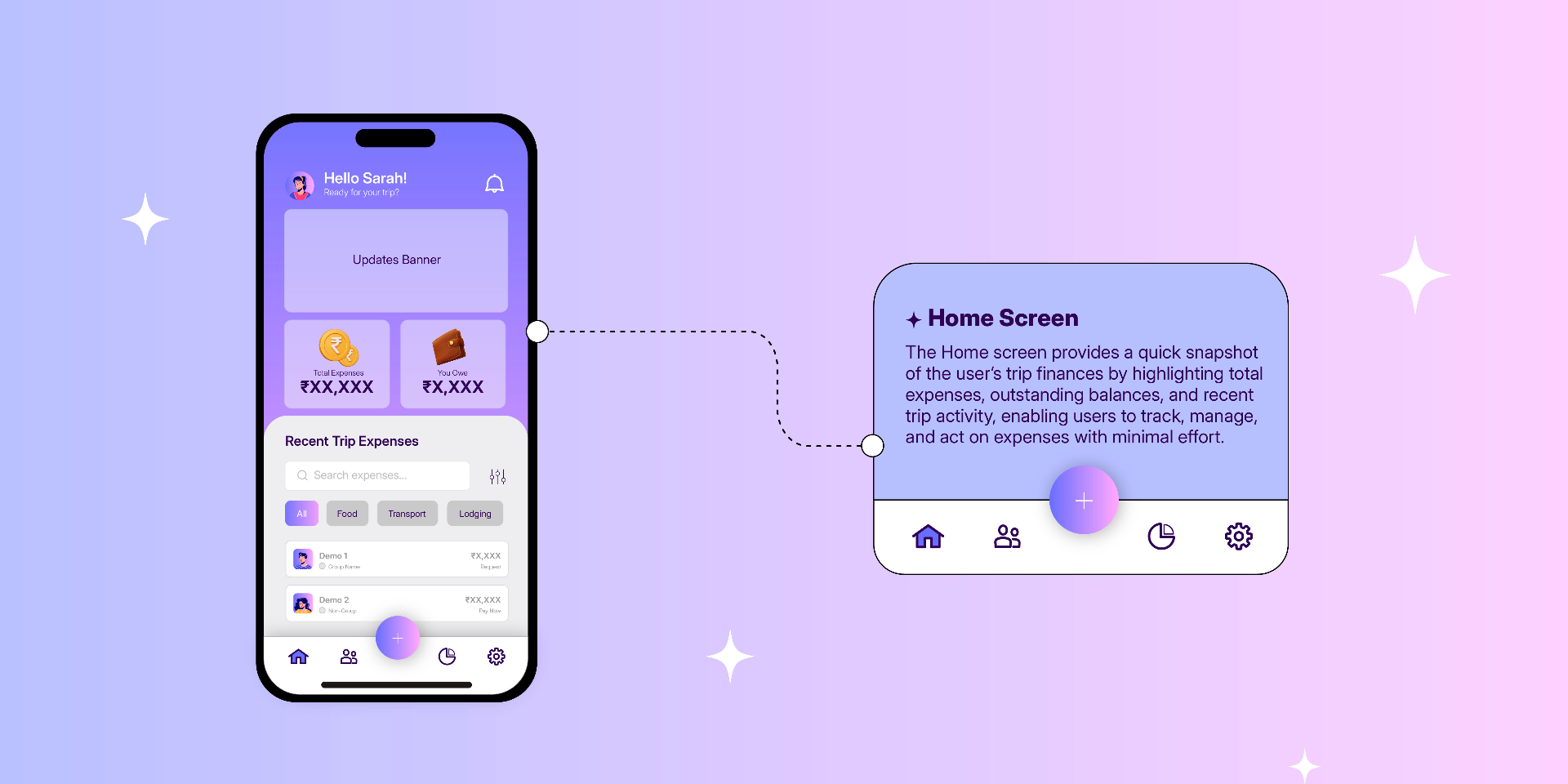
06 — Key screens — Home, Add Expense, Split, Settlement
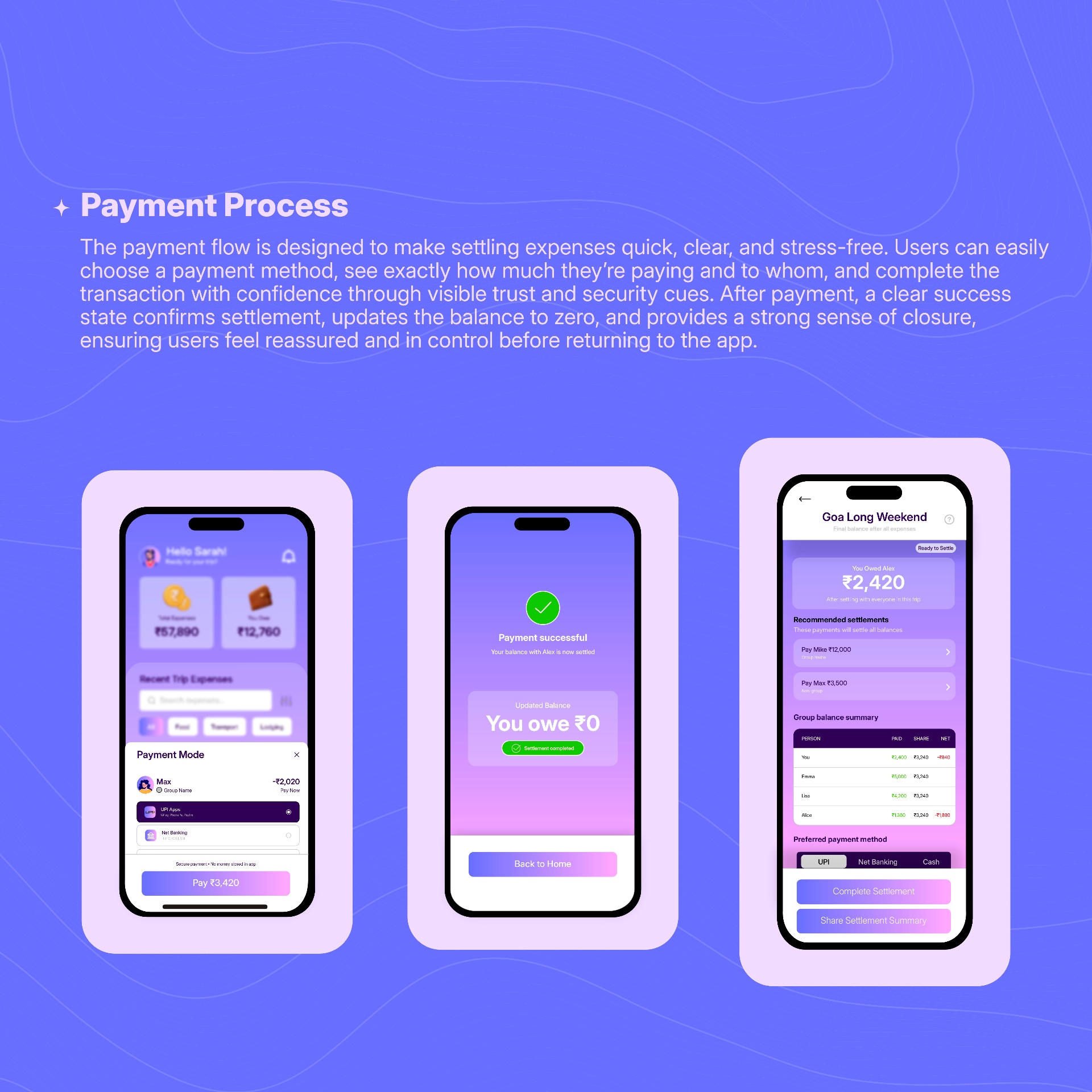
07 — Payment success — You owe ₹0
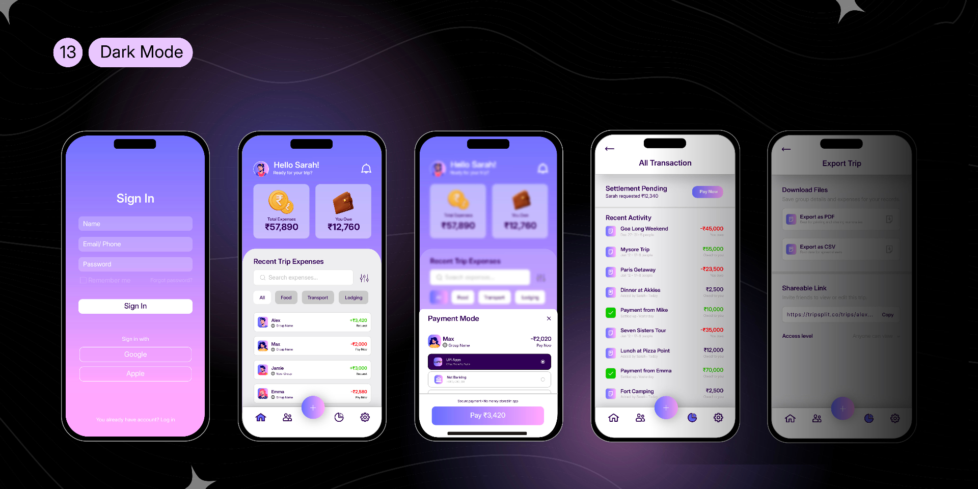
08 — Dark mode screens
Reflection
Biggest Insight
People don't struggle with payments alone, they struggle with trust, coordination, and clarity while managing shared expenses. Reframing the product around that shifted every decision that followed.
What I Learned
What the project reinforced about product design:
- Product design is about simplifying collaboration, not just building interfaces.
- Scoping ruthlessly protects the core behaviour a product is trying to change.
- Emotional friction, not functional friction, is usually the harder problem.
What I Would Validate Next
If developed further, the next step would be validating assumptions against real user behaviour and iterating on product metrics:
- Whether groups adopt a shared tracker mid-trip, or only reach for one at the end
- How willing users are to log small everyday expenses in real time
- Whether visual balances actually reduce disputes, or just delay them
- Retention across a second and third trip once novelty fades
Looking Ahead
"TripSplit isn't trying to replace UPI or wallets. It's designed to solve the moment before the transfer, the agreement itself. That's the space I would keep exploring."