Zoraya.
Brand & Packaging Design for a modern Indian hair-care label.
Project
Zoraya
Type
Brand & Packaging Design
Role
Lead Designer (Freelance)
Duration
2–3 months
The Framework
01 — What I Observed
Hair care category dominated by gold, brown, beige — safe, forgettable, generic. Brief: modern Indian, bold colors, stand out.
02 — What I Questioned
Why does natural have to mean muted? Indian beauty is vibrant and celebratory. Why are hair oil brands apologizing for that?
03 — What I Changed
Bold teal as primary — fresh and modern. Illustration of woman with braided hair and argan botanicals. Two-font system: bold rounded wordmark + clean minimal body. Full 360 packaging system — bottle + carton.
04 — What Happened
Delivered in 2 iterations. Live on houseofzoraya.com. 4.9 stars, 128 reviews. Packaging drives purchase decisions.
The Story
The brief: modern Indian, bold colors, stand out from everything on the shelf.
The insight: every competitor was doing earthy and muted. Indian beauty is vibrant — the packaging should be too.
Every design decision was mine — color, typography, illustration direction, label layout, and print production.
Delivered in 2 iterations. Live in market. 4.9 stars, 128 reviews.
What this provesA strong brief interpreted boldly, executed cleanly, delivered on time.
Visual Gallery
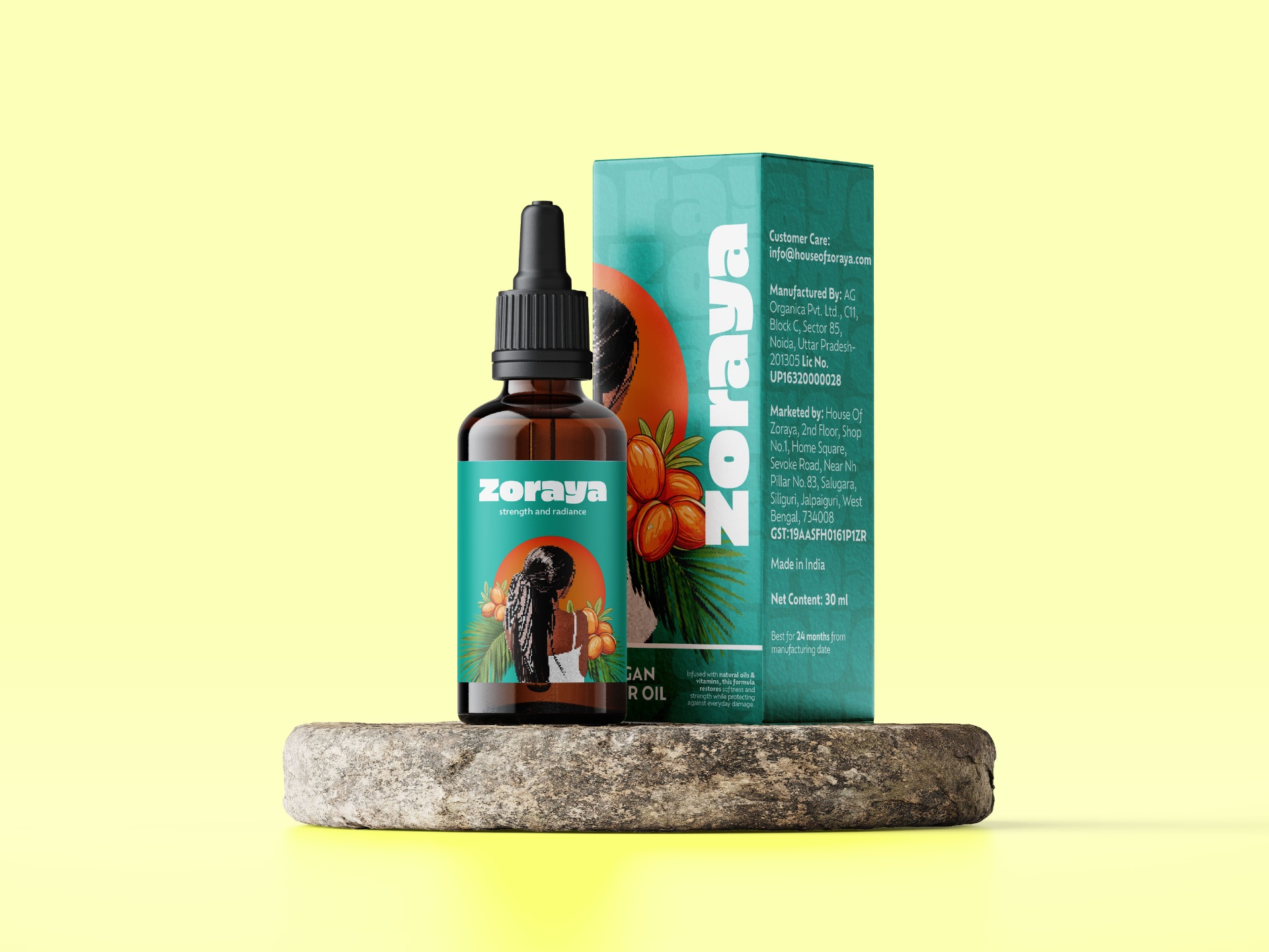
01 — Final product mockup · bottle + box on teal background
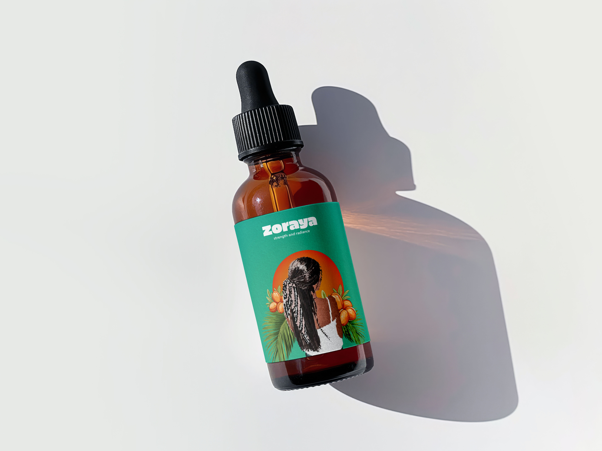
02 — Bottle label closeup
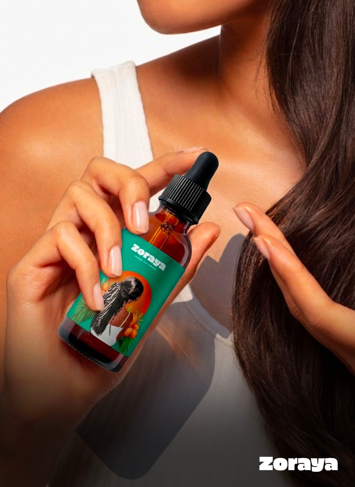
03 — Creative Direction
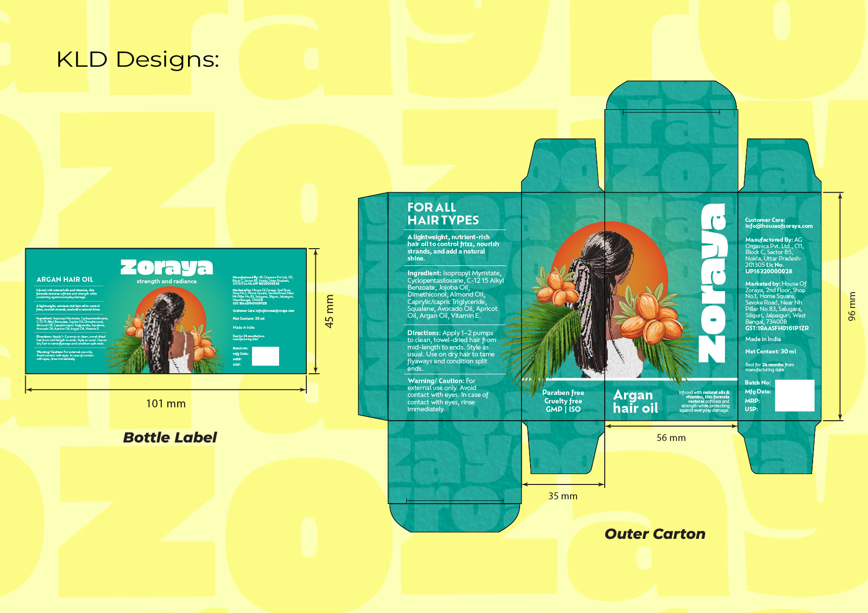
04 — KLD dieline — bottle label + outer carton
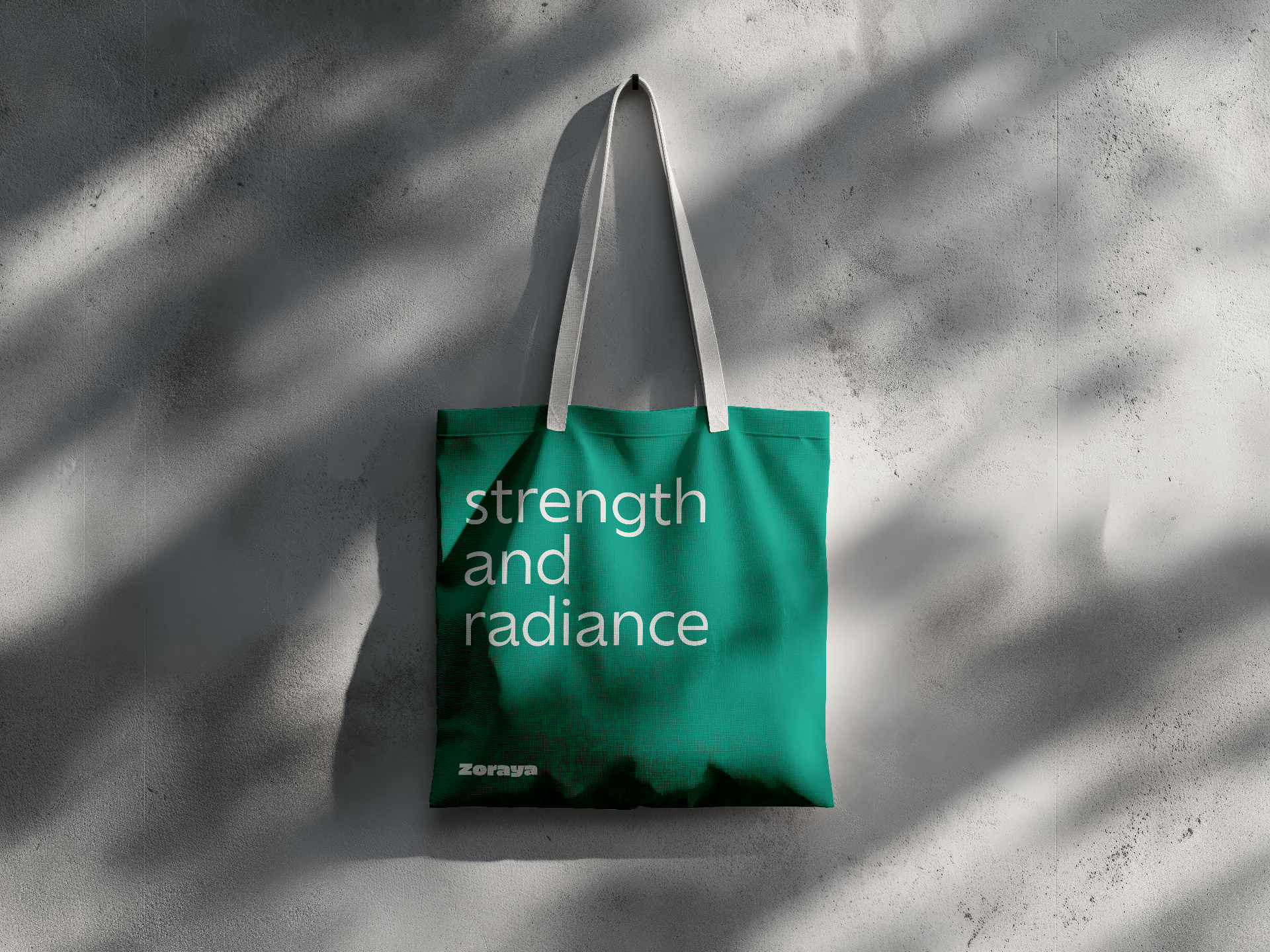
05 — Bag mockup